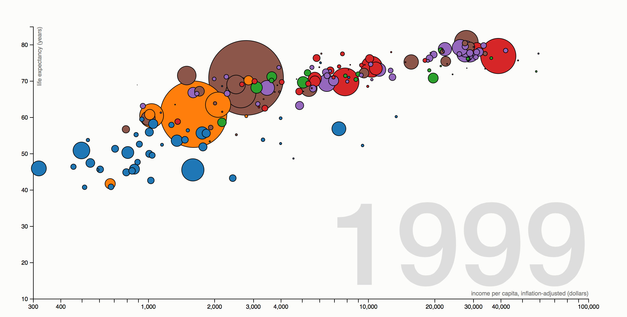
Fascinating graphic that shoes the wealth and health of nations through time.
http://bost.ocks.org/mike/nations/
Source: Tom Carden, Gapminder.
This is a recreation in D3 of Gapminder’s Wealth & Health of Nations, made famous by Hans Rosling’s memorable 2006 TED talk. It shows the dynamic fluctuation in per-capita income (x), life expectancy (y) and population (radius) of 180 nations over the last 209 years. Nations are colored by geographic region; mouseover to read their names.
As Tom Carden noted, there’s a surprising amount of work that goes into making something look simple. For one, data collected in recent years is consistent, while data prior to 1950 is sparse; although potentially misleading, these visualizations use linear interpolation for missing data points. The lookup for the two interpolation values at each frame is accelerated using bisection of sorted arrays per dimension.
Interested to see how this chart was implemented? View source! Want a fun project? Try adding a Voronoi overlay (as in this airport diagram) to improve mouseover interaction on small targets. Or try a static version, using trails instead of motion.

